
Brand Guidelines
These principles guide how The Freedom Fast is represented across materials, partners, and public communication.
Usage Principles
The Freedom Fast brand represents a national civic practice rooted in reflection, dignity, and shared responsibility. Use of the Freedom Fast name, logo, language, and visual identity should reflect the spirit of the practice.
The Freedom Fast invites people into a steady civic rhythm: Pause to reflect, Dialogue to relate, and Serve to heal. Communication should carry this same posture — calm, respectful, and welcoming to people from many backgrounds and beliefs.
Partners, hosts, and collaborators are encouraged to use Freedom Fast materials in ways that preserve this tone of invitation and civic care. Participation is voluntary, and the language of the movement reflects dignity, compassion, and shared responsibility.
For guidance on vocabulary, tone, and messaging frameworks, refer to The Freedom Fast: Social Media Language Bible, which supports consistency across all public communication and helps steward the integrity of the Freedom Fast across communities and platforms.
Logo Usage
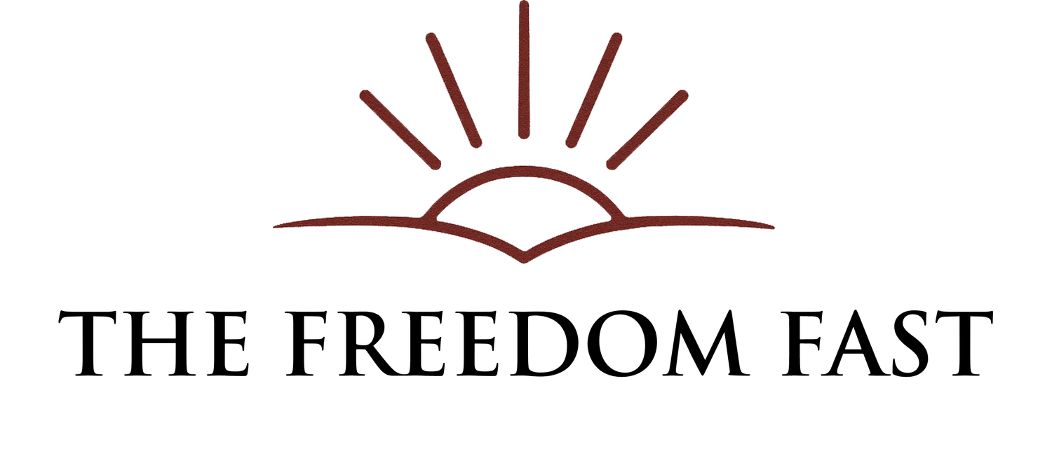
The Freedom Fast logo serves as the primary visual symbol of the movement and should be used consistently across all materials.
The Freedom Fast logo reflects the idea of a new day beginning — a moment to pause, listen, and renew our shared civic life.
The horizon line represents the place where we meet one another in shared space. The rising light suggests renewal, clarity, and the quiet possibility that emerges when people step back from reaction and choose reflection, dialogue, and care for the common good.
The symbol reflects the rhythm at the heart of the Freedom Fast: Pause to reflect. Dialogue to relate. Serve to heal.

Stacked Logo

Horizontal Logo
Light on Dark (Reversed Logo)
Clear Space
Maintain adequate space around the logo so it remains visually distinct and uncluttered. No text, graphics, or images should appear within this space.
Minimum Size
The logo should always appear at a size that ensures readability. Avoid using the logo at sizes where the text or symbol becomes difficult to recognize.
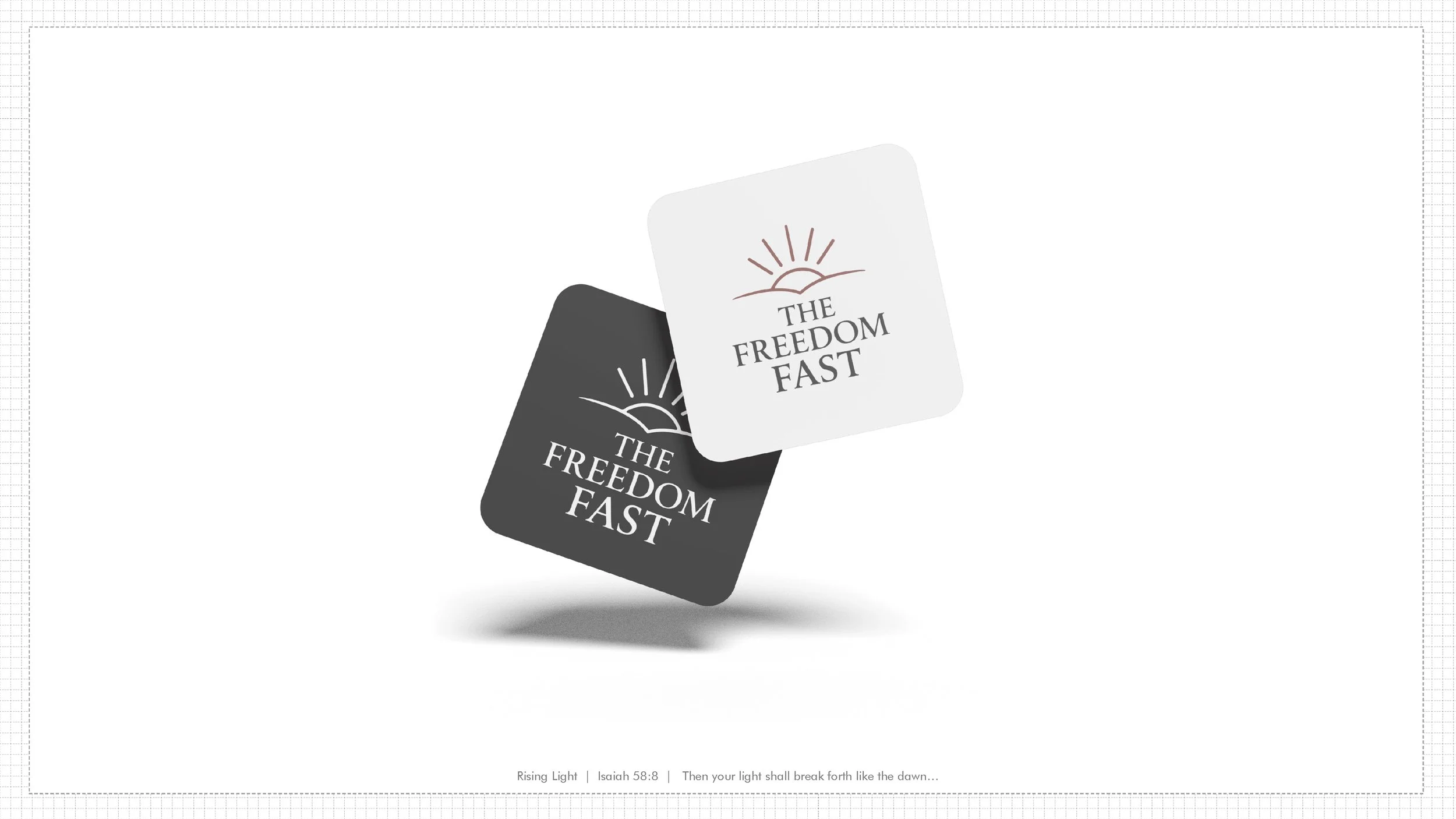
Correct Logo Usage
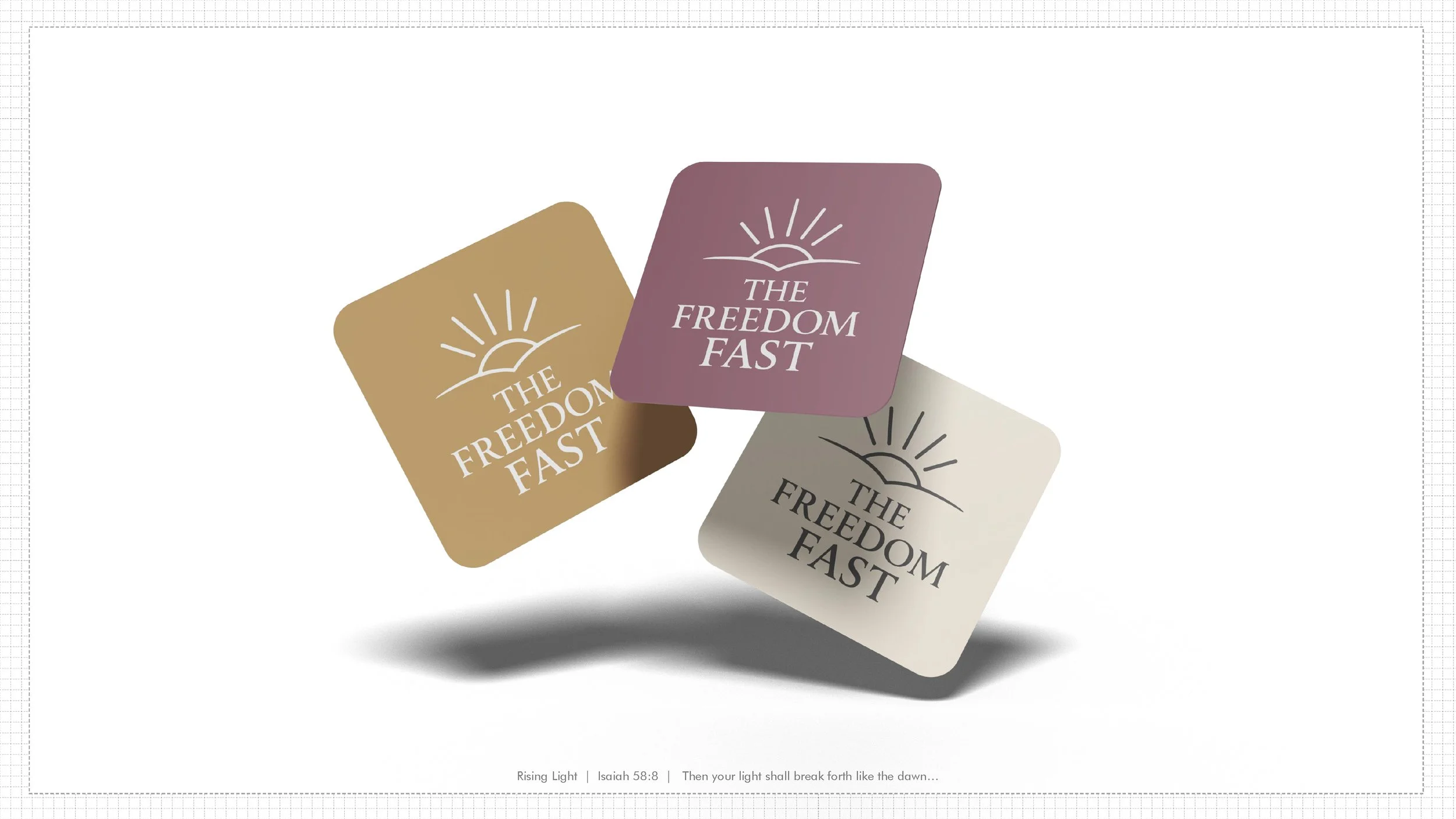
The Freedom Fast logo is provided in three approved variations to support different formats and backgrounds. Each version maintains the integrity of the design while allowing flexibility across materials and platforms.
Horizontal Logo
The horizontal logo works well in wide formats such as website headers, documents, presentations, and banners.
Stacked Logo
The stacked version is well suited for square or vertical layouts such as social media graphics, posters, and other compact spaces.
Light on Dark (Reversed Logo)
A white version of the logo may be used on dark backgrounds or on any approved Freedom Fast brand color. This ensures strong contrast and clear legibility.
The reversed logo may appear:
white on black
white on dark photography
white on any approved brand color background
Select the version that provides the clearest and most balanced presentation within the available space.
Incorrect Logo Usage
To preserve the clarity and integrity of the Freedom Fast identity, the logo should not be modified or used in ways that alter its appearance.
Avoid the following:
Changing the colors
Use only the approved brand colors or the approved white (reversed) version.
Stretching or distorting the logo
The proportions of the logo should always remain intact.
Adding visual effects
Avoid shadows, outlines, gradients, or other effects.
Rearranging the elements
The symbol and text should remain in their approved configurations.
Placing the logo on backgrounds that reduce visibility
The logo should always remain clear and legible.
Combining the logo with other graphics or text
The logo should stand on its own and remain visually distinct.
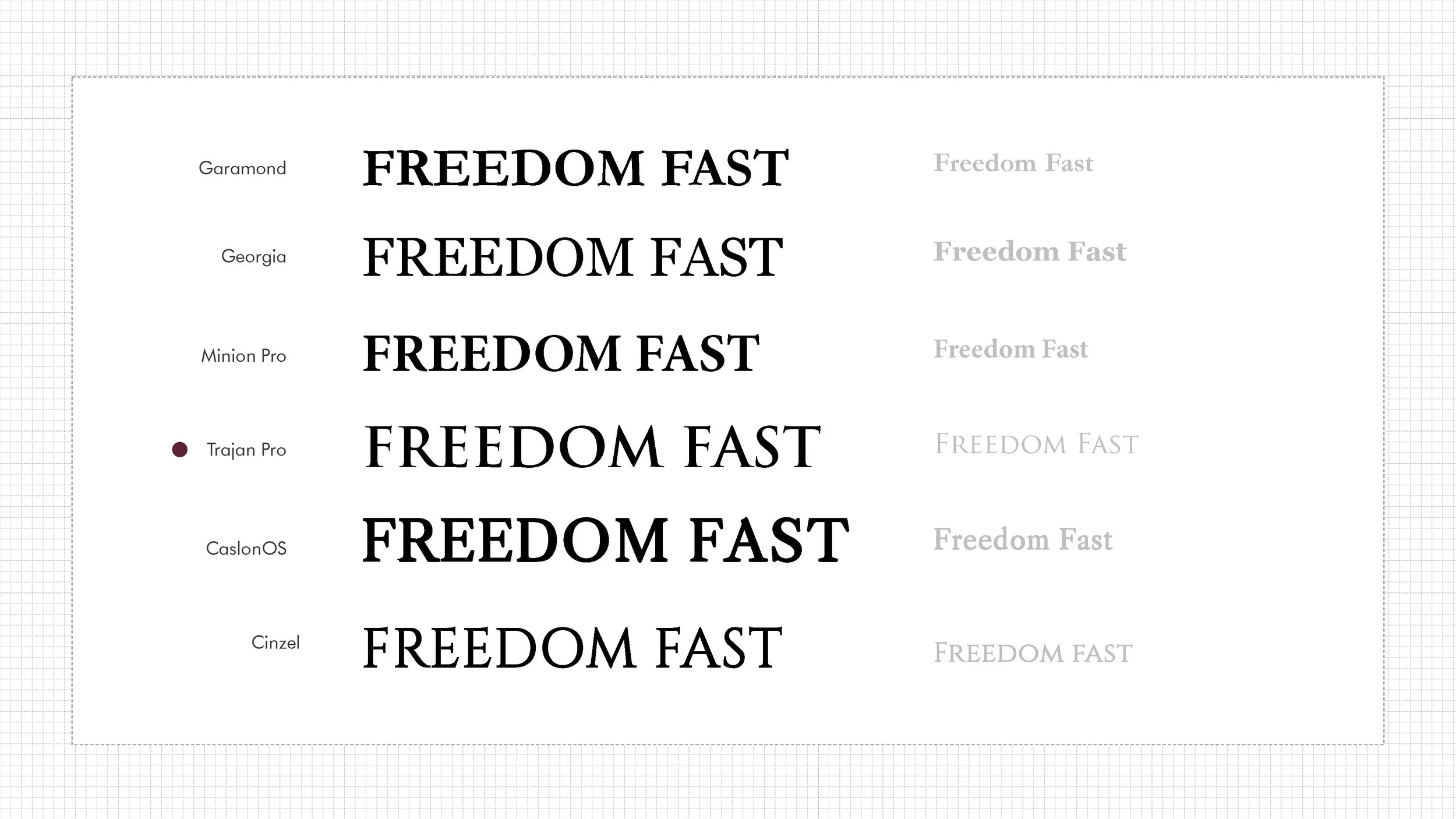
Fonts
Here are some quick links to the most used fonts in our collateral. You can download the entire font pack here.
Headers and Headlines
Helvetica Neue Condensed Bold
Consistent use of the logo strengthens recognition of the Freedom Fast and helps steward the movement as it grows across communities and partners.
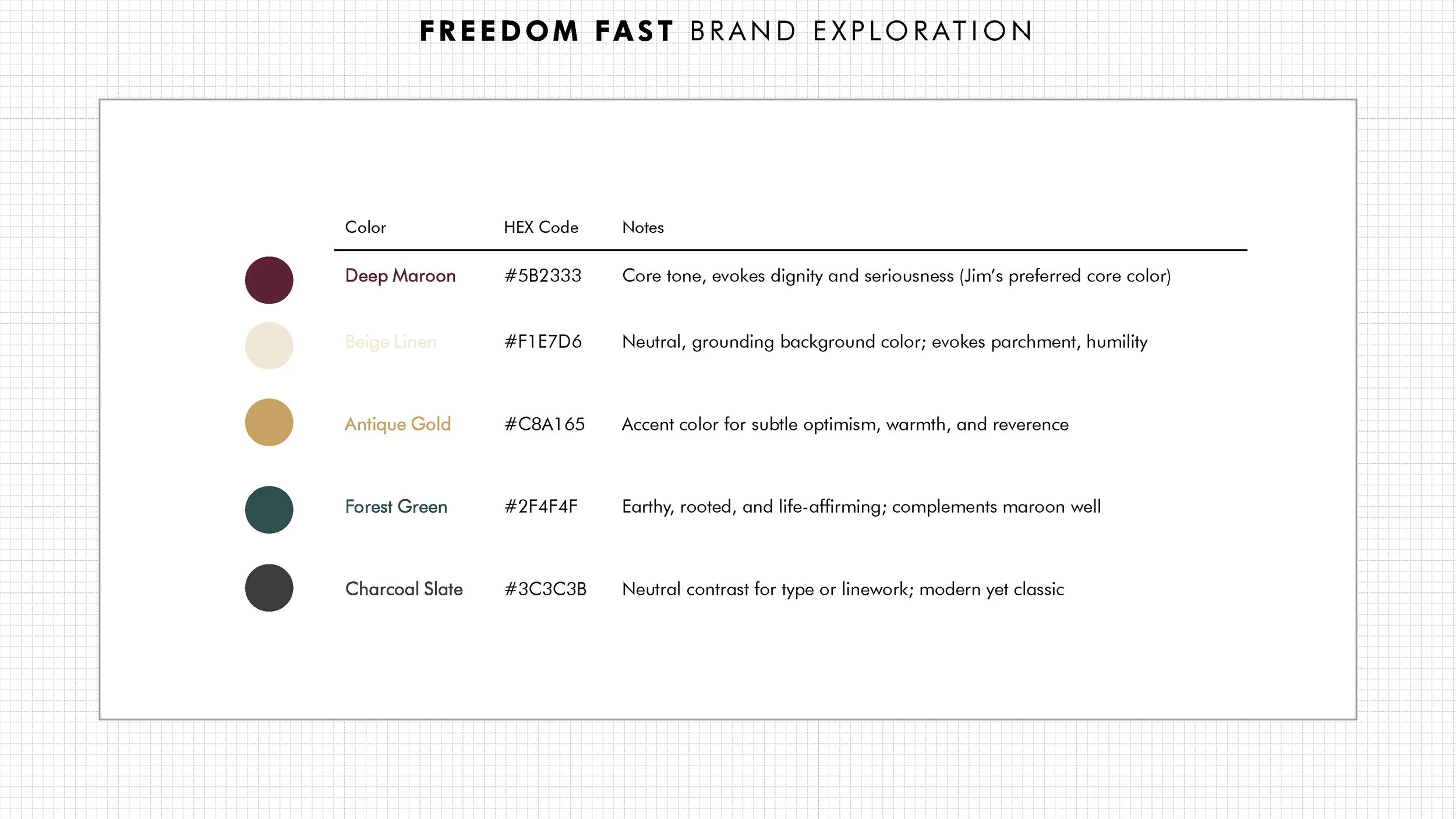
Primary Colors
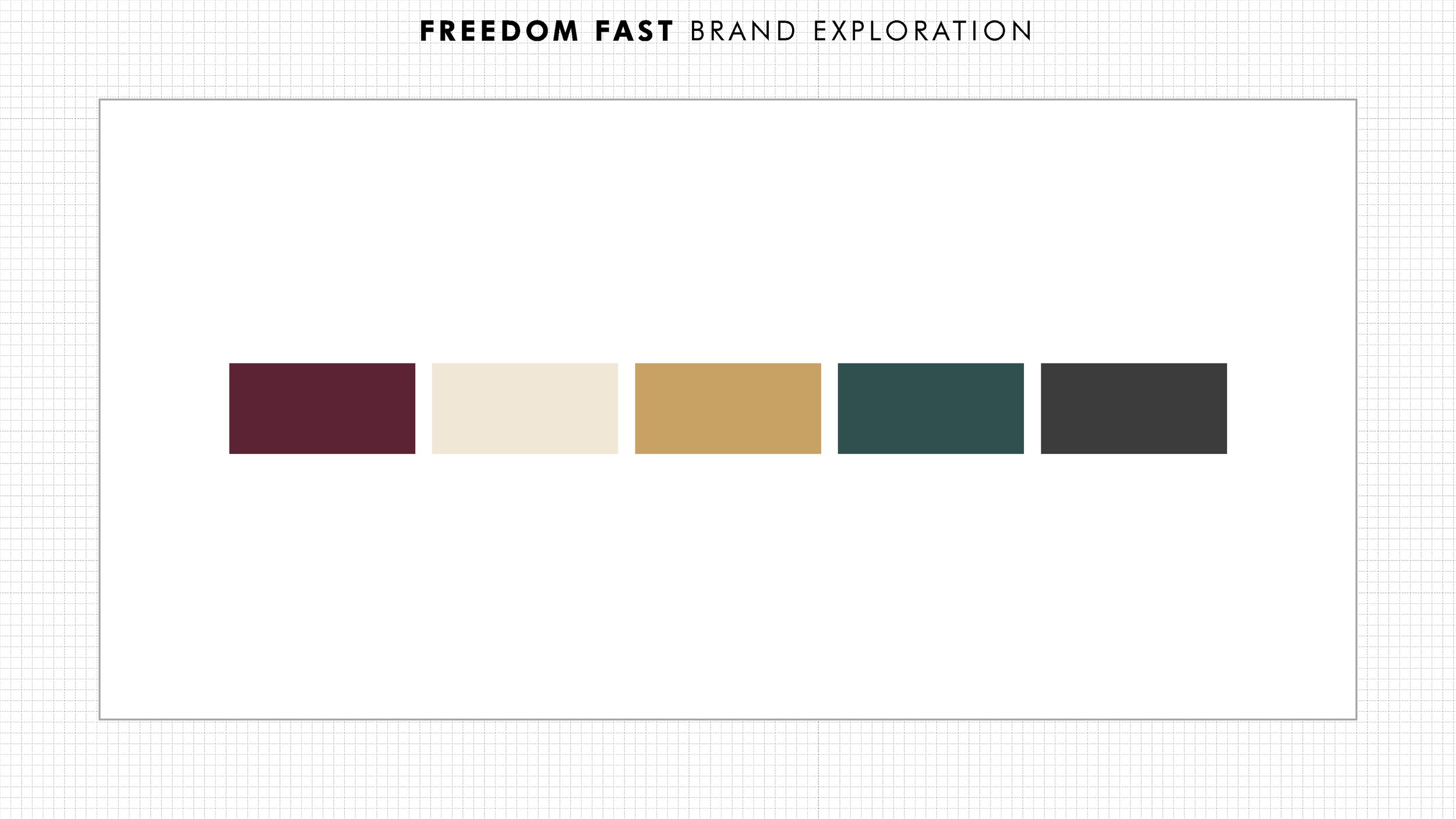

Secondary Colors
Warm Accents
Antique Gold –
#C8A165
Evokes tradition, warmth, and quiet elegance.Burnt Sienna –
#A24E3F
Adds rustic, earthy dimension. Great for banners or CTA highlights.Dusty Rose –
#B98B8B
A softened, modern nod to maroon — perfect for hover states or subtle backgrounds.
Neutrals for Contrast
Charcoal Slate –
#3C3C3B
Provides weight and visual anchor — ideal for text or footer.Soft Taupe –
#9C8D84
Gentle neutral for form backgrounds or borders.Ash White –
#FAF9F6
Almost-white with warmth — for large background areas.
Grounding Natural Tones
Olive Green –
#708060
Symbolizes peace and growth. Works beautifully in accent illustrations or badges.Muted Forest Green –
#475B4E
A serious, sacred tone — great for quiet emphasis.Slate Blue Gray –
#6A7B8C
Balances warm palette with calming stability — works well for partner logos or links.
Contact / Brand Stewardship
If you have questions about brand use or need assets, contact:
Freedom Fast Communications Team
info@thefreedomfast.us
The Freedom Fast belongs to the people who practice it. These guidelines help ensure it is shared with clarity, dignity, and care.